What the Room Is Saying: Using Production Design as a Storytelling Language
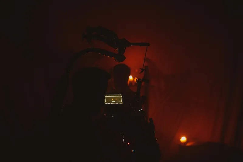
Here's something worth sitting with: your audience starts forming opinions about your characters before those characters open their mouths. The second a room appears on screen, viewers are processing color, texture, spatial arrangement, clutter or the absence of it — and drawing conclusions. That's not accidental. That's production design doing exactly what it's supposed to do.
For filmmakers who are still treating set design as a logistical checkbox — we need somewhere to shoot the scene — this is the conversation that might change how you approach every project going forward.
The Room Knows Things the Script Doesn't Say
Think about the first time you walked into someone's home and immediately got a feeling about them. Before they said a word. That same instinct fires in your audience every time a new location appears on screen. The question is whether you're steering that instinct or leaving it to chance.
Take Breaking Bad as a textbook case. The White family home starts out as a portrait of suburban mediocrity — beige walls, mismatched furniture, a house that feels like it's apologizing for itself. That visual language is doing heavy narrative lifting. It tells you everything about Walter's suppressed ambition, his financial anxiety, and the suffocating smallness of a life that doesn't fit him. As the series progresses and Walt's world transforms, so does the visual environment around him. The design team isn't decorating; they're writing subtext.
Or consider The Grand Budapest Hotel, where Wes Anderson's almost architectural use of symmetry and color saturation isn't just an aesthetic signature — it's a storytelling mechanism. The hotel's pink grandeur against a drab, encroaching world signals an entire emotional thesis about nostalgia, elegance, and inevitable loss. You feel the story before you understand it.
Color Theory Isn't Just for Art School
Color in production design functions like a second score — it operates emotionally, beneath conscious awareness. Filmmakers who understand this use color to guide audience feeling without telegraphing it.
David Fincher's work is a masterclass in this. The desaturated, sickly green-gray palette of Se7en wraps every frame in dread. Nothing in that world looks healthy or safe, and that's entirely by design. The color grading and the production design work in tandem to make the environment itself feel like a threat.
On the flip side, look at how Parasite uses the Kim family's cramped, semi-basement apartment versus the Park family's sprawling modernist home. The contrast isn't just economic — it's architectural class warfare. Natural light floods the Park residence. The Kims live below ground level, literally looking up at the world through a narrow slit of window. Bong Joon-ho and his production designer Lee Ha-jun didn't need a single line of expository dialogue to communicate the gulf between these two families. The spaces said it all.
Spatial Composition and What It Does to Power
How characters move through and relate to a space is just as loaded as the space itself. High ceilings and wide, open rooms tend to make characters feel small, exposed, or out of their element. Tight, cluttered spaces can signal comfort and familiarity — or claustrophobia and entrapment, depending on how they're shot.
In There Will Be Blood, Daniel Plainview's increasingly vast and empty surroundings mirror his psychological deterioration. The bigger his world gets, the more isolated and monstrous he becomes. That's not coincidence. The production design is tracking a character arc.
For filmmakers working on tighter budgets — which, let's be honest, is most of us — this principle is actually good news. You don't need a massive set or a period-accurate location to tell a story through space. You need intentionality. A single prop placed deliberately can shift the emotional register of a scene. The stack of unopened mail on a kitchen counter. The single chair facing the window. The photo frame turned face-down. These choices cost almost nothing and carry enormous narrative weight.
Designing for Character, Not Just Aesthetics
One of the most useful questions you can ask when building or selecting a location is: What does this space say about the person who lives in it? Not what does it look like — what does it say?
A character's environment is their autobiography. Their taste, their obsessions, their financial situation, their emotional state, their aspirations — all of it gets encoded in the objects and spaces they inhabit. When a production designer — or a filmmaker wearing that hat — makes choices that are rooted in character psychology rather than visual preference, the result is a kind of coherence that audiences feel even when they can't articulate it.
Look at Amy Dunne's meticulously curated home in Gone Girl. Everything is placed, everything is perfect, and that very perfection is deeply unsettling. The design is a character portrait of someone performing a life rather than living one. It's genius storytelling that never requires a line of dialogue to land.
Practical Application: Thinking Like a Production Designer
You don't need a full design department to start thinking this way. Here's how to bring this mindset into your own work:
Start with character psychology. Before you scout a location, write out what the character values, fears, and hides. Then ask whether your location reflects, contradicts, or complicates those things.
Be deliberate about color temperature. Warm tones create intimacy and safety. Cool tones create distance and unease. Know which emotional register you're working in before you walk onto set.
Control the clutter. The density of objects in a space communicates a lot about a character's mental state and lifestyle. A sparse, minimal space reads differently than one packed with accumulated stuff. Make that choice on purpose.
Think about sightlines. Where can characters see from where they're standing? What are they blocked from seeing? Spatial relationships create power dynamics, and power dynamics drive drama.
Use texture. Rough versus smooth, worn versus pristine — tactile qualities in a set register emotionally even on a two-dimensional screen. They signal history, care, neglect, and wealth in ways that are immediately readable.
The Silent Partner in Your Story
Production design is one of those crafts that succeeds most completely when audiences don't notice it. When it's working, viewers are just absorbed — they feel the world, they trust it, they read the characters through it without knowing that's what they're doing. That invisibility is the whole point.
But for the filmmaker building that world, it has to be deeply intentional. Every surface, every color choice, every object placement is a sentence in a visual language that runs parallel to your script. When those two languages are saying the same thing, your story achieves a kind of resonance that dialogue alone never could.
The room is always talking. Make sure it's saying what you mean.